01
Marketplace home
Category-led discovery, popular local products, and recommended vendors create a quick, familiar entry point.
 Let's talk
 Marketplace Platform
A community-first marketplace that brings the neighborhood palengke online—connecting Filipino shoppers, local vendors, fresh products, delivery, and order tracking in one approachable experience.
PAPortfolio case studyView case studyInterface story
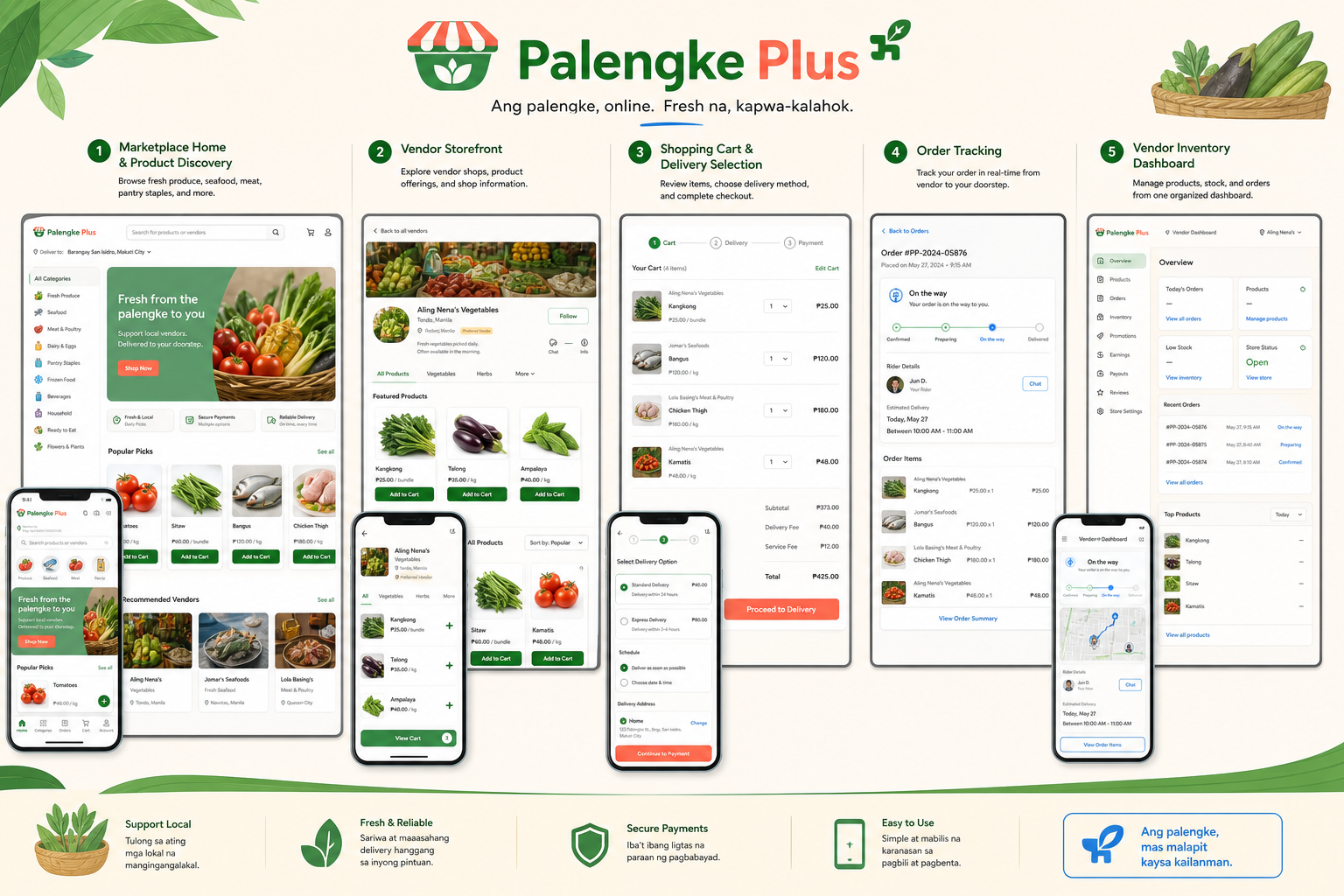
Five connected views show the customer and vendor experience from discovery through fulfillment.
Category-led discovery, popular local products, and recommended vendors create a quick, familiar entry point.
Each seller gets a focused space for identity, product range, freshness cues, and shopper confidence.
A guided checkout makes quantities, fees, address, schedule, and payment decisions easy to review.
A calm status timeline keeps the customer informed from confirmation through doorstep delivery.
Orders, stock, products, and store health are brought together in one practical operating view.
Palengke Plus translates the familiar rhythm of a Filipino public market into a clear digital journey. The product is designed around two connected audiences: customers who need confidence in freshness and delivery, and vendors who need a simple way to manage products, stock, and orders.
Fresh-food shopping depends on trust, familiarity, and fast decisions. The interface needed to preserve that local feeling while making discovery, vendor comparison, payment, fulfillment, and order status understandable for customers who may be new to online grocery shopping.
I organized the experience around the customer journey—discover, compare, add, choose delivery, and track—then mirrored the same order lifecycle inside a lightweight vendor dashboard. Visual cues, familiar produce photography, peso pricing, and concise labels keep the platform recognizably local.
The resulting concept combines a browse-first marketplace, vendor storefronts, a guided checkout, real-time delivery status, and an inventory workspace. Responsive patterns keep the essential actions close at hand on both desktop and mobile.
The case study demonstrates a complete two-sided marketplace flow rather than a single storefront screen. It gives future collaborators a concrete view of how product thinking, interface design, and full-stack implementation can work together.
A local-commerce product feels trustworthy when the interface reflects real buying habits. Clear vendor identity, visible delivery details, and familiar language do more for confidence than adding extra features.
Portfolio note. These visuals present the product direction and interface scope in a client-friendly format. Live previews and public repositories are linked where available.
Start a conversation
Have a product, platform, or engineering challenge in mind? I'd be glad to hear what you're building.
Start a conversation